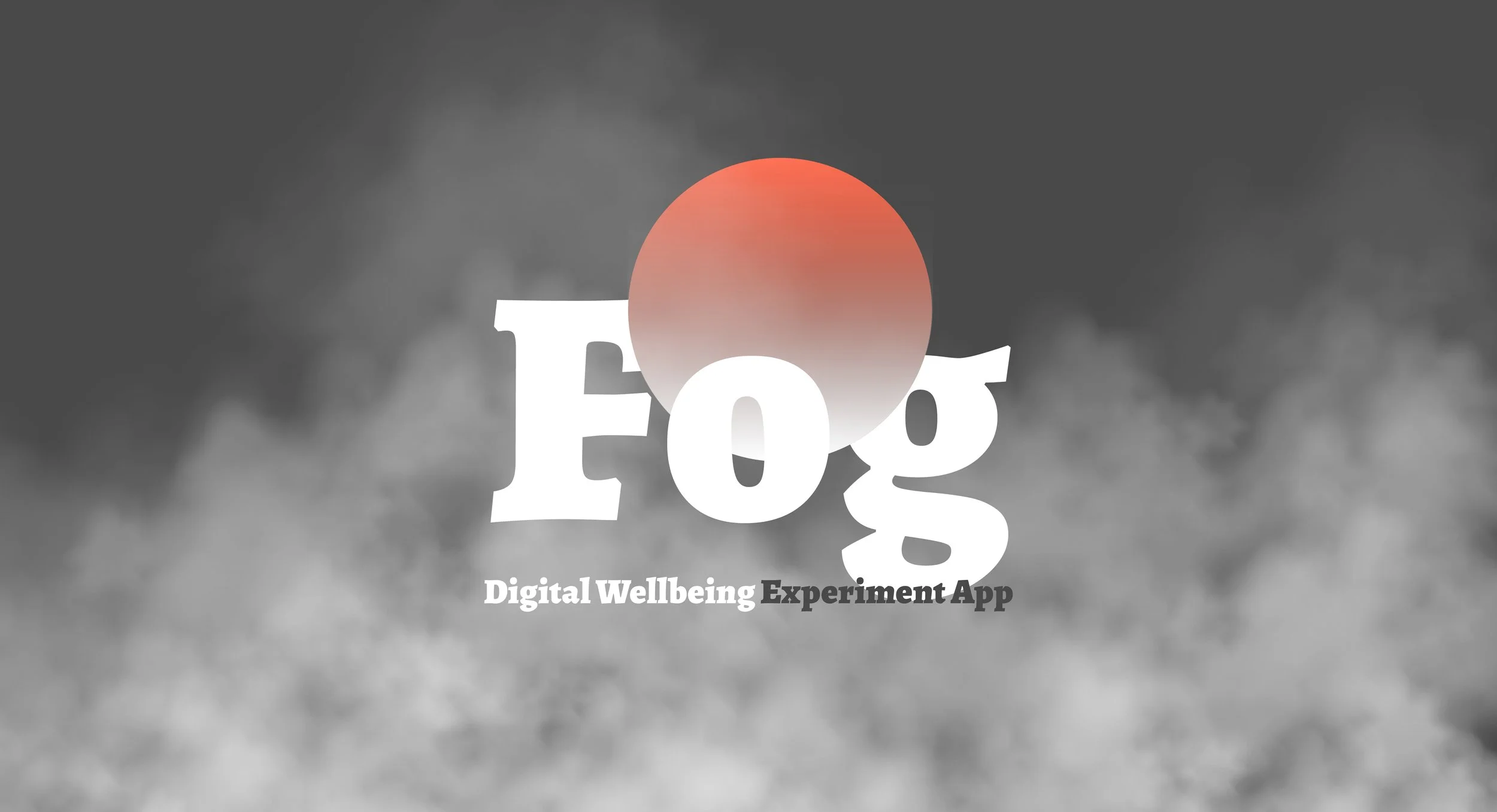
Fog
Info Architecture · UX UI Design
Designing a digital wellbeing app that helps users build healthier, more intentional relationships with technology.
#UI/UX #Interaction Design #Motion Design #Problem Solving #Speculative Design #Accessibility
Fog is a digital wellbeing app designed for users experiencing Nomophobia — helping them track screen time, set boundaries, and develop mindful habits through an intuitive, experiment-based experience.
01 THE CHALLENGE
Technology should improve our lives, not compete for our attention.

As technology becomes more deeply embedded in daily life, the line between intentional use and compulsive habit has become increasingly blurred. The challenge wasn't just to track screen time — it was to design an experience that helps users build a healthier, more intentional relationship with their devices.
02 BACKGROUND
“NOMOPHOBIA”
Nomophobia — NO MObile PHone PhoBIA — describes the psychological condition of feeling anxious or distressed when separated from mobile phone connectivity.
It is widely recognized as a behavioral pattern driven by compulsive device dependency.
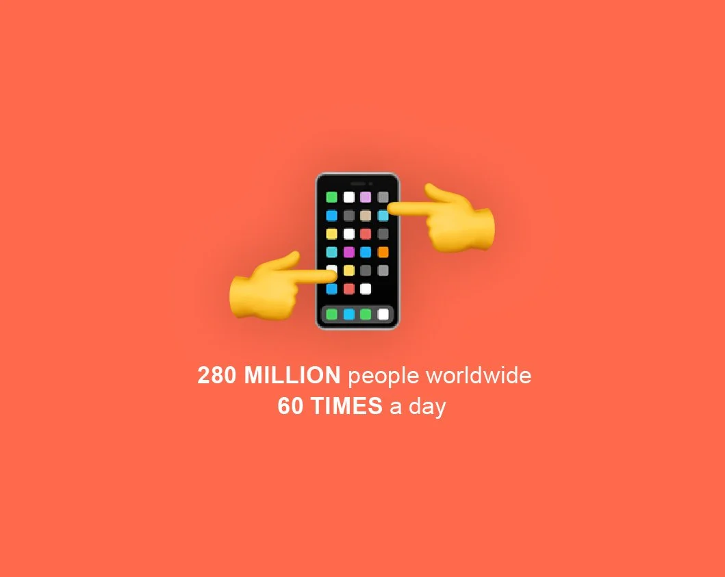
280 million people worldwide open mobile apps more than 60 times a day — making this not a niche problem, but a global behavioral design challenge.
03 THE SOLUTION
Three Design Principles to Shift Behavior
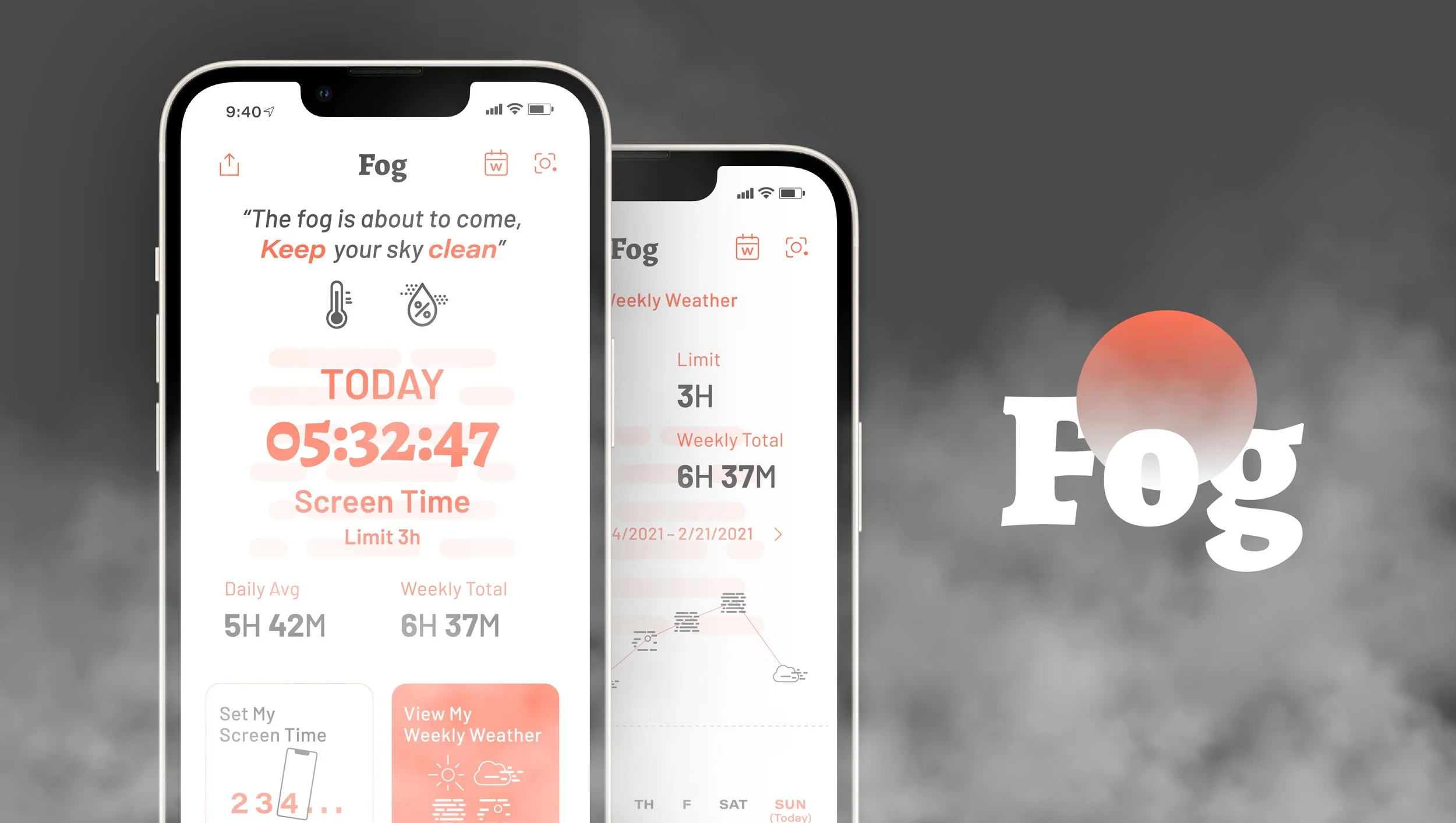
Fog addresses screen time not through restriction, but through awareness, connection, and motivation. Using weather and fog metaphors as visual language, the app helps users understand their usage patterns intuitively — and gives them the tools to set boundaries on their own terms.
-
Real-time screen time tracking with contextual notifications that alert users when approaching or exceeding their set limits.
-
Bridging digital and physical awareness. When screen time reaches a set threshold, Fog surfaces real-world weather conditions as a contextual nudge — encouraging users to step away from their device and engage with the world outside.
-
Community-driven accountability. Users can compare their screen time habits with friends and neighbors — turning behavior change into a shared experience rather than a solo effort. Social comparison creates gentle, ongoing motivation to stay on track.

Final Screen
Designing technology that promotes healthy use – not just awareness.
Process Highlights
04 RESEARCH
Do existing digital wellbeing apps actually change behavior?
My research started from a personal observation — existing screen time apps send notifications when limits are reached, but users consistently ignore them. The problem wasn't awareness. It was engagement and motivation. I set out to understand why current solutions fail to drive lasting behavior change.
Competitive Analysis
I audited leading screen time and digital wellbeing apps — including Screen Stopwatch and Activity Bubbles — to map their feature sets and identify where they fall short. The analysis revealed a consistent gap: apps track usage well, but fail to make the experience meaningful enough to sustain behavior change.
Competitive Analysis of Existing Platforms (Digital & Printed Materials)
User Interview
I conducted interviews with 3 users who had experience with screen time limit apps, focusing on friction points, unmet needs, and motivation patterns. Two critical insights emerged:
Users set goals but gave up quickly — unrealistic targets created a cycle of failure that eroded motivation over time.
Users wanted accountability through community — sharing progress with friends was seen as a key motivator for staying consistent.
Key Takeaways
Track usage meaningfully — users want data that feels actionable, not just numbers.
Make the current state visible — existing interfaces felt generic and disengaging.
Bridge digital and physical — users wanted a reason to put the phone down, not just a reminder.
Enable social accountability — without community features, motivation drops quickly.
05 IDEATION
Fog as metaphor
The core design insight was to make screen time feel tangible — not abstract. Rather than numbers and bars, I used fog density as a visual metaphor: as screen time increases, the fog thickens. As usage clears, the fog lifts. This transforms a passive data experience into an intuitive, emotionally resonant one.
Lofi-User Testing
I built low-fidelity paper prototypes and conducted 3 usability testing sessions to validate core interaction flows. Three key tasks were tested: 1) setting a screen time limit, 2) reviewing weekly usage history, and 3) managing accessibility shortcuts. Findings directly informed the information architecture and interaction model for the final design.
Key Takeaways
Users responded strongly to real-world weather integration — seeing outdoor conditions while fogged in created a compelling nudge to go outside.
Users wanted longitudinal tracking — the ability to review past behavior was essential for long-term habit management.
The fog metaphor resonated, but needed richer contextual messaging to be immediately understood at first glance.
06 ITERATE
Key design decisions
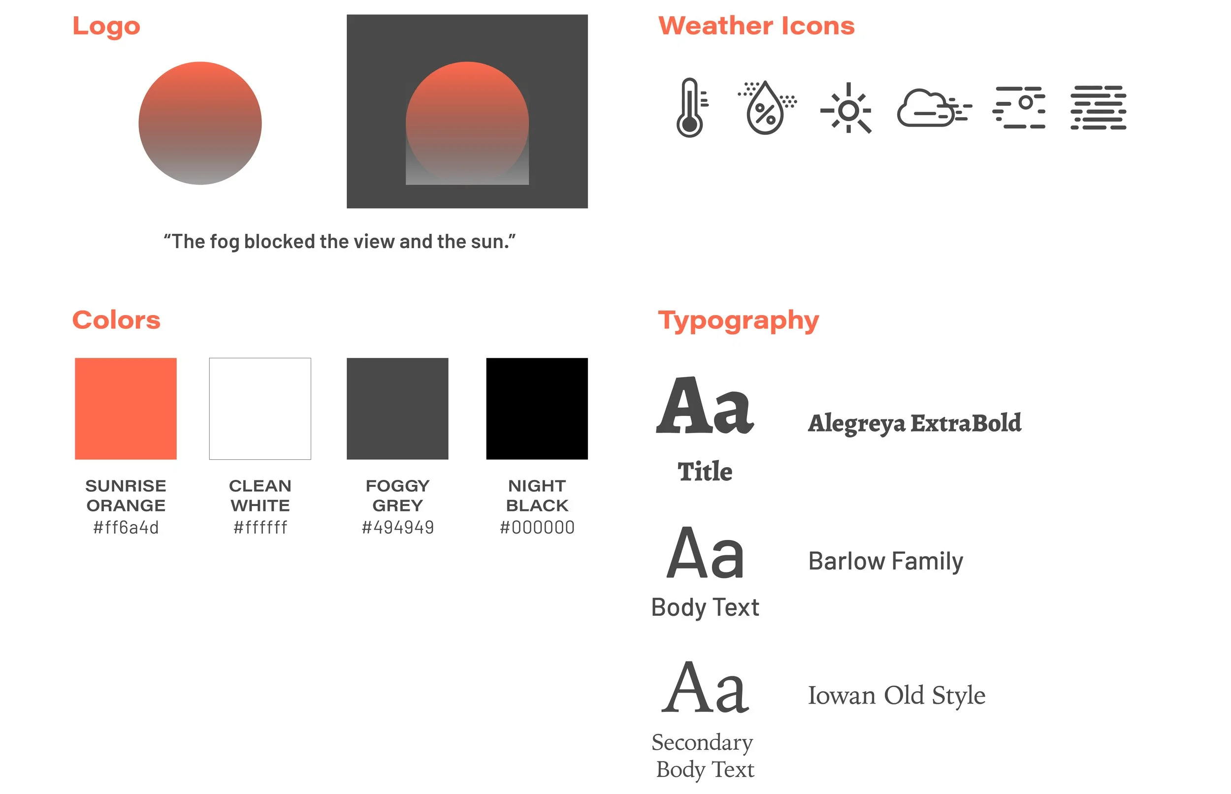
1) Style Guide
For the color schemes and logo design, I was inspired by the image of the foggy morning.
2) Action Items Layout & Accessibility
Very early on when exploring, usability testing revealed that each action information on a rectangle card is hard to read further across the page, so I reconstructed creating squared boxes with more concise information, which improved navigation overall.
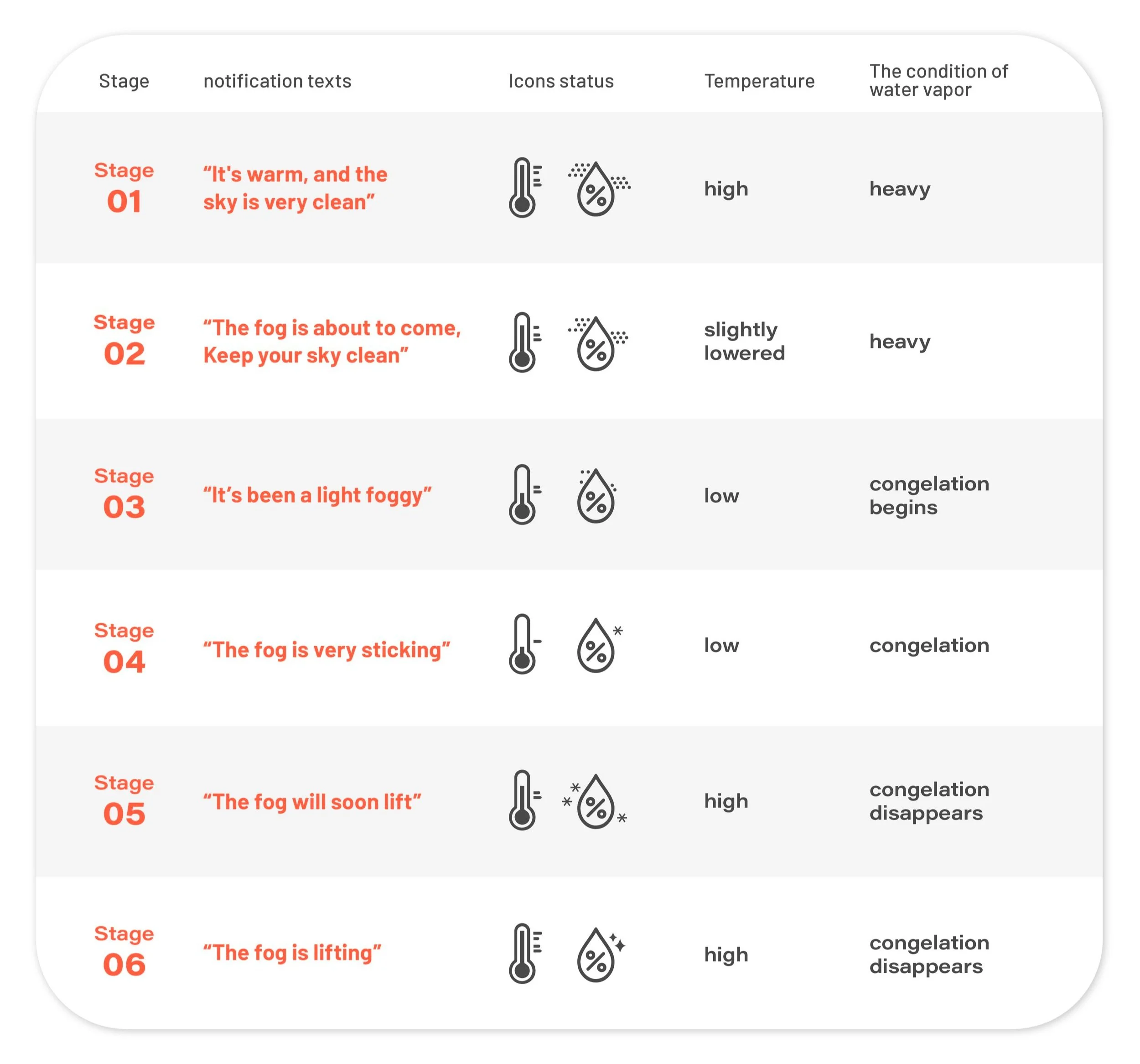
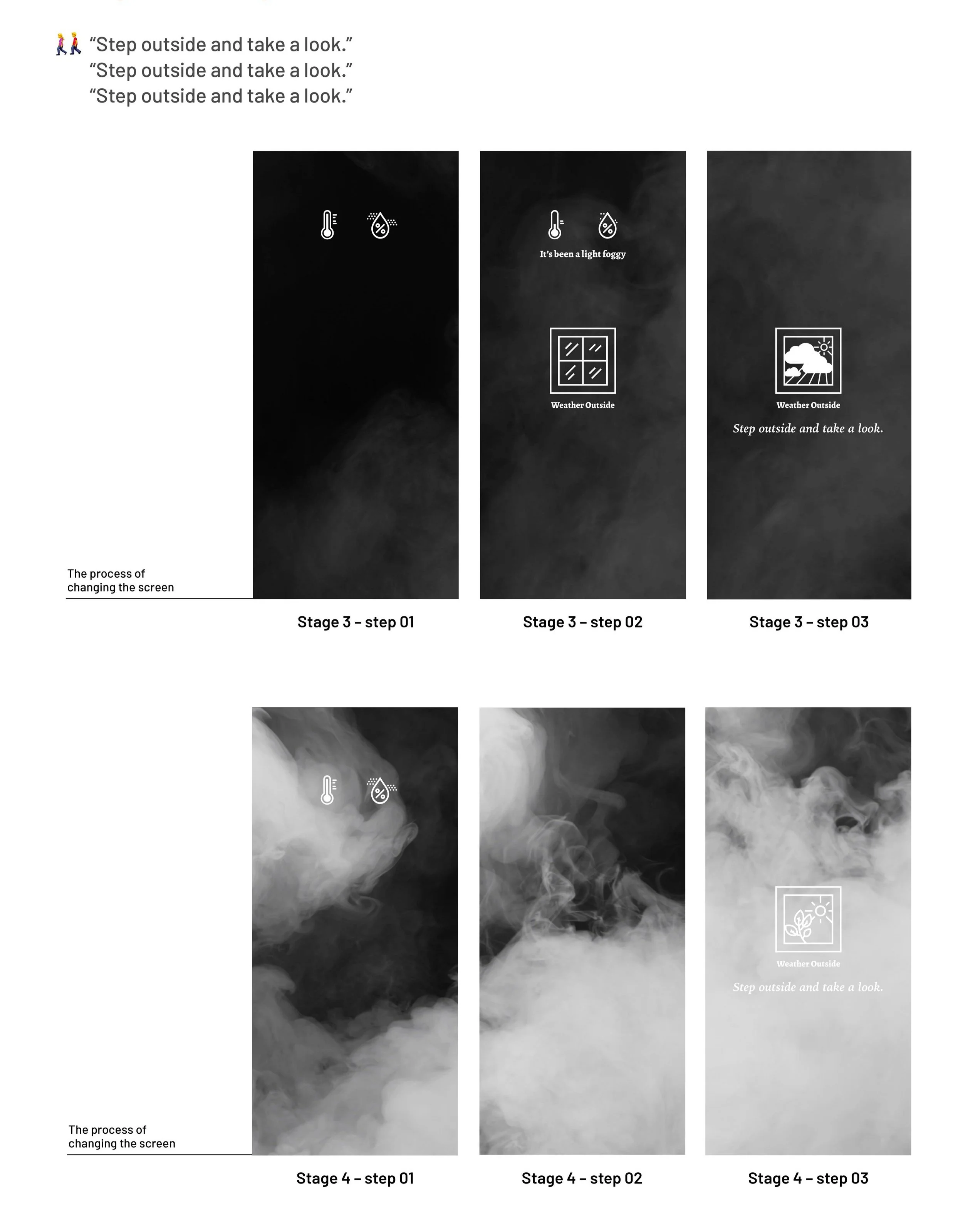
3) Real-Time Alarm
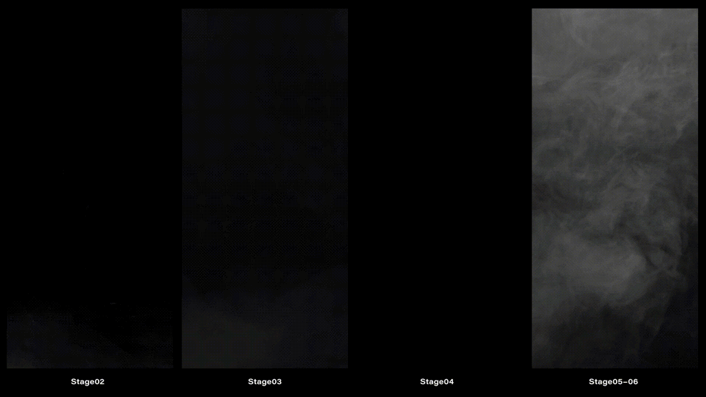
I constructed six stages of current screen time status using caution messages and icons as visual languages. Along with the real-time notice, I made fog effects to show the status directly to the user.
07 DESIGN
Final app design
1) User Journey Map
I created some key user journey maps in order to evaluate and optimize the user experience of viewing the current and past screen time data in weather view modes, staying motivated, and sharing experiences with other users.
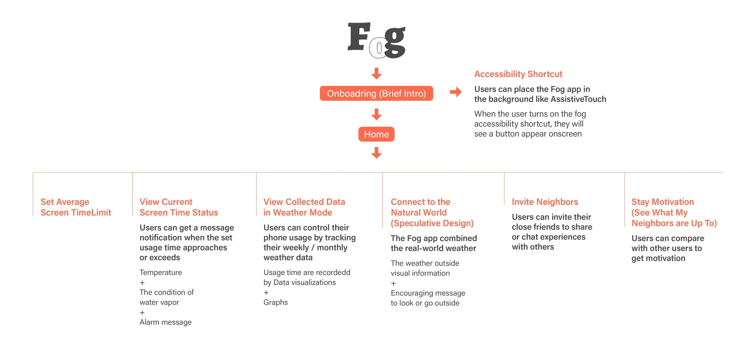
2) Wireframe
I focused on the onboarding page to make the easy-breezy onboarding process with minimized steps. Also, I provided permission opportunities for the user to try extra functions before they start the app.
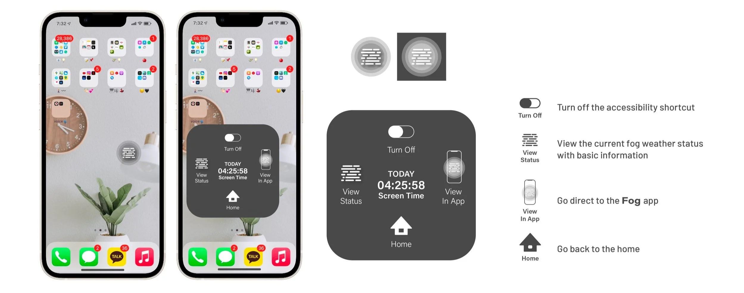
3) Accessibility Shortcuts
Users can place the Fog app like Assistive Touch(iPhone). When the user turns on the accessibility shortcut, they'll see a button appears on the screen.
4) Speculative Design
Fog bridges the digital and physical by surfacing real-world weather conditions as a contextual nudge. When screen time approaches or exceeds a user's set limit, the app displays current outdoor conditions alongside an encouraging message to step outside. On clear, sunny days, the contrast between the digital fog and the real world becomes a natural motivator to disconnect.
5) Final Demonstration
Accessibility Simulation
Speculative Design with A Fog Pattern
07 REFLECT
Validated by the people building it
After completing the project, I reached out to developers working on similar mobile applications to gather external perspective on the design. The feedback validated the core concept while surfacing meaningful questions for the next iteration.
“The unexpected visual language for tracking phone usage is compelling — but the onboarding needs to make the fog metaphor immediately legible at first glance.”
“The speculative design approach is genuinely thoughtful. The next challenge is controlling the fog state dynamically — how does the screen transition as time accumulates or resets?”
These questions directly shaped the improvement roadmap and confirmed that the core interaction model was strong enough to build on.
Fog demonstrated that behavior change design requires more than awareness — it requires emotional resonance, social connection, and an experience compelling enough to come back to.
What’s next
1) Move from tracking to insight
Evolve screen-time visualization from descriptive data to behavioral insight – enabling users to recognize patterns, deviations, and cumulative impact at a glance.
2) Expand usability testing
Expand usability testing across contexts and edge cases to ensure the fog state logic scales reliably in real-world conditions.
3) Measure behavioral impact from users
Define success through longitudinal behavior shift — not just usability — validating whether Fog meaningfully changes user habits over time.